There are two fundamental styles of eBook – The Fixed Layout and Responsive version. They have gone by many names: fixed layout, replica, mobile friendly, adaptive, reflowable. Here is a simple way to remember which is which. Your ebook can either have every element Fixed in position, an exact Replica of the document you designed and converted. Or, it can Respond and Adapt to the reading device by reflowing the text and media (hence all the alternate names). Which one is better? Your eyes will tell you.
Fixed? Responsive? Do I need them both?
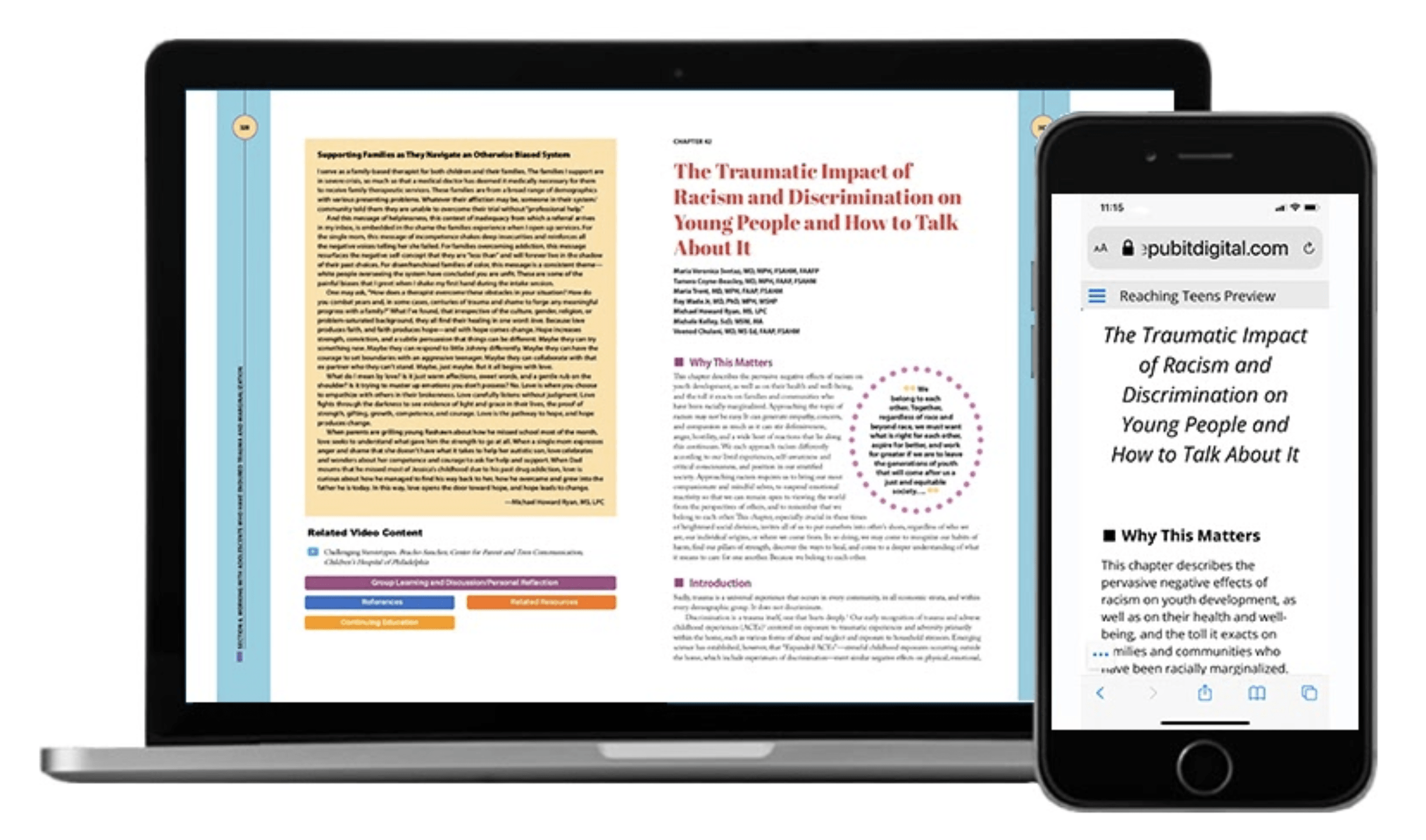
The answer revolves around two things: your end user’s visual experience and their ability to understand your message. Is it readable? Is it understandable? In Figure 1, the laptop displays a Replica view of the PDF file designed by the creative team. Since this document is also printed as a book, it has graphical treatments intended to enhance the paper experience at full size. If viewed on a smaller tablet or phone, the Replica would still look exactly the same, only much smaller.
The phone in figure 1 displays the responsive view of the same page. Can you see some key differences?
Figure 1: A Replica and Responsive view of the same page
When converting this to a responsive format where text must be free to resize and reflow, certain graphical treatments are no longer possible to retain. The Circle of dots around the callout, the yellow tint box behind the copy block, the yellow circles containing page numbers on top of the blue sidebar with rotated text. All of these stylistic design elements provide visual appeal on paper and even in the replica, however, they are not necessary to the message delivery. In a version that must change from device to device, these types of graphical treatments are not technologically supported either.
Fear not! If an elaborate graphical treatment (a table, a diagram, a flowchart) is critical to delivering your message properly, they are simply captured as a complete object and inserted into the Responsive version that way. The Responsive view guarantees your content will be readable and understandable on any size device.
The views can coexist in the RePubIT platform and can be programmed to auto-sense your device and display the best view for you. If you prefer one or the other, a single click changes your view.
Use a Replica view when:
- Security is critical. Delivering PDFs in a password-protected subscription environment secures them from theft and sharing.
- Monetization must be easy. Set up free previews and purchasing for individual documents or subscriptions.
- Complex Design must be retained. A brochure, a cookbook, graphic-rich documents retain their design.
- Speed is important. Simply upload your printable PDF and it can be viewed on any device immediately.
- Enhancements must be easy and fast. Turn anything on your pages into a link or button. Stream Youtube, launch podcasts, jump to another page, popup additional information with a few clicks. Drag and drop hotspots anywhere to add rich content to your static PDF page.
The Responsive view shines when:
- Your consumers prefer to read material on small tablets and phones.
- Your replica content was designed with print in mind. Elaborate print documents are often large with small text. When that page is reduced to a small enough size to fit on a phone, the text is so small it is illegible. Responsive view reflows all of the copy on your phone or mobile device so it is easy to navigate and completely readable.
- Readability – Users can change font size with a quick click or tap
A bit of history behind Replica vs. Responsive
In 2006 Amazon approached us to test early versions of their new reader and develop the proper file format to play inside the, as yet to be named, Kindle. I recall the first versions, black and white text, no images, and the page visibly flashed each time you turned it. Fast-forward 14 years and the eBook has evolved from a black and white, text-only toddler to an interactive, immersive reading and learning experience.
The initial eBooks were all Responsive style. Depending on the size of your screen, the text will reflow and the images will resize to fit the display. Users may even change the font size to enlarge it easing the reading experience. Flip through pages like a book or scroll through them like a website. The key takeaway is Responsive pages are very adaptive to the reader.
In exchange for that flexibility, you trade elaborate design. Text and media elements cannot overlap. They typically flow in a single column, in proper read order like the early days of internet pages. As designers, you feel confident that it will be legible on almost any device… it’s just not fancy.
Of course, as engineers, we tried to make an ebook out of everything only to quickly discover Responsive ebooks were ideal for romance novels but not for books that relied on a specific structure. If the placement of graphics, styled text, tables, callouts, or other elements was critical to delivering the correct message Responsive was not an option.
Enter the Replica version. This version of the ebook retains the exact formatting and style of its printed sibling. Magazine columns remain intact, photos and text can overlay one and other as in comic books. Replica made it possible to produce Children’s books, cookbooks, magazines, textbooks, anything visually engaging to be quite honest.
Traditional ebook platforms design for one or the other making users choose a style before purchasing.
RePubIT Digital combines both versions into a single publication. The reader software senses your device and can default to one view or another depending on whether you enter the ebook from a phone tablet or laptop. As a further enrichment, RePubIT will embed the audiobook tracks or enable the narration engine, based on Amazon Polly technology to read the ebook aloud. See the table below to understand more about the publication styles.
What if you could have both… at the same time?
With RePubIt’s standard admin dashboard you can publish both the Fixed Layout version and the Responsive Version in a single publication. Users can flip back and forth between the two depending on their personal preference. The Professional Admin dashboard adds the ability to activate RepubIT’s Narrator engine to read the Responsive view to you. Instant Audiobook.
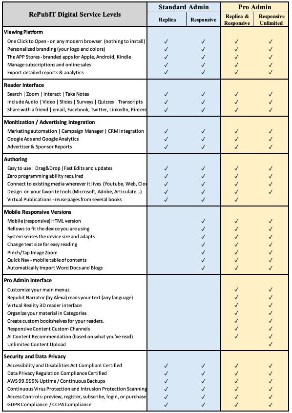
Figure 2 – RePubIT Digital Features and Capabilities (Standard and Pro)
Email [email protected] to inquire how RePubIT can support your digital publishing needs
~ John B. Costa is the Founder and CEO of RePubIT and chair of numerous international standards bodies for online educational technology.


